Media Kit
Get to know a little about our visual personality and what makes us who we are.
Crafted with intent
Our visual brand is the expression of our character come to life. At Participate's core, we are knowledge creators dedicated to being the place where the world learns, together. Our approach is centered in building community, and we value being a place where inclusion, delight and daring to be bold are at the forefront of everything we do.
Our logo
Participate is at the heart of where connection and knowledge creation unify. Our logo mark instills the importance of our inner-outer loop model of merging knowledge building with practice and community.


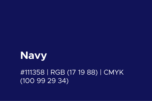
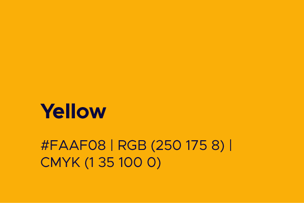
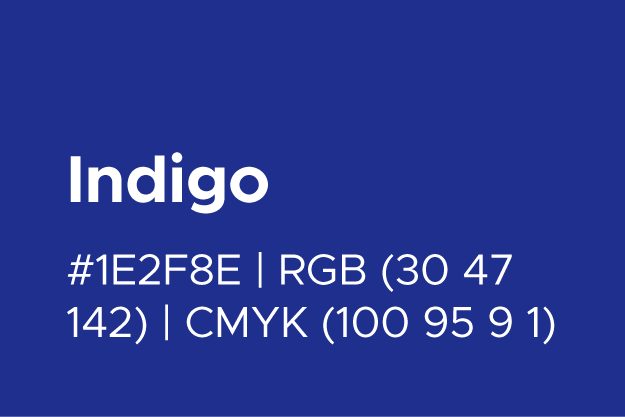
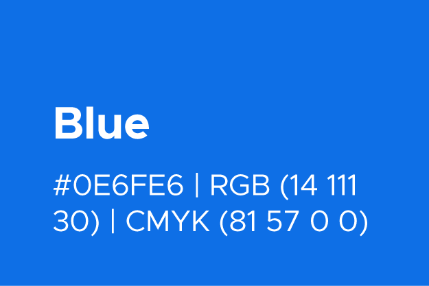
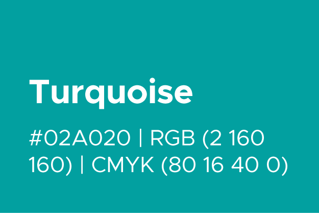
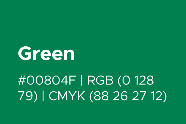
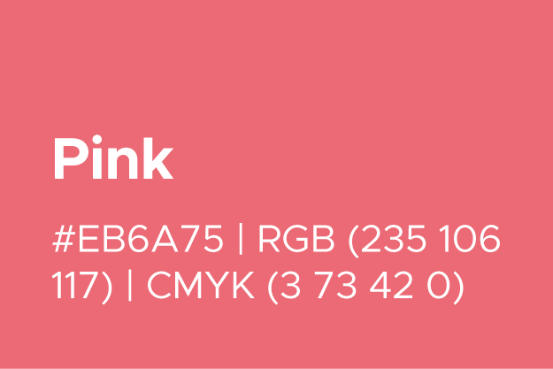
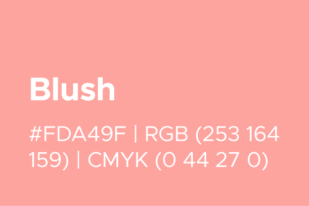
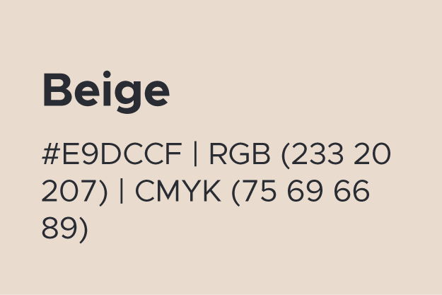
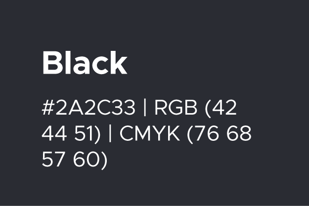
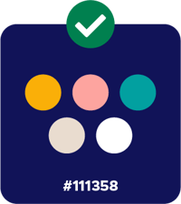
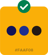
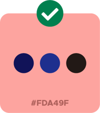
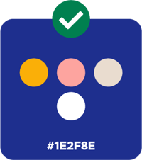
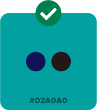
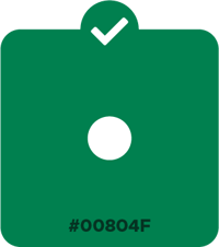
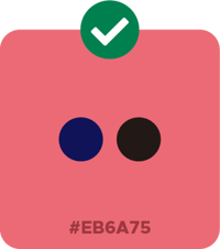
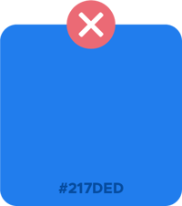
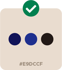
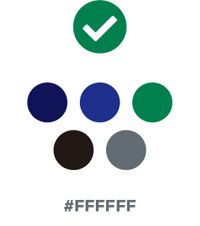
In order to align with accessibility standards, combinations of our brand colors have been tested with an ADA compliance contrast ratio checker to determine which colors have the best outcome for easy readability. These combinations are primarily recommended for text readability at all sizes, and will be adhered to across all content creation. With graphics and illustrations, the color combinations are more flexible; however, we recommended that you check color contrast ratios for colors as you design.
The colors combinations below are compliant with accessibility standards. For example, when using a yellow background and deciding on a text color, you may pair it with our navy, blue or black.
Shapes and iconography

To reflect the diversity of ways in which we learn, connect and grow, a staple of our illustration style is the layering of our classic shapes and weaving flowing lines throughout to demonstrate connection and the ebb and flow of learning. Shapes are universally understood, dynamic and accessible. Our illustrations maintain rounded corners for a more welcoming feel. Any transparency is set to 40% opacity.
Photography
We use inclusive, bright photography as a way to celebrate the diverse human identities represented in our user base. Feeling like you can see yourself in our ecosystem is of utmost importance to us.
Photos may also be masked with one of our signature illustration shapes to maintain consistency throughout visual language.

